Established Design Layouts
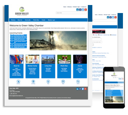
Responsive design is on the rise. Building a website on a responsive framework means it will automatically adjust for optimal viewing and navigation no matter what device a user is accessing your site from. One specific benefit is visitors to your site will get the same great experience from their desktops to their mobile devices which also means you have one site to maintain. Additionally, responsive sites have stronger SEO value over multiple domains. All ChamberMaster layout packages are now responsive for your convenience.
Let us put this new website design option to work for your organization.
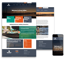
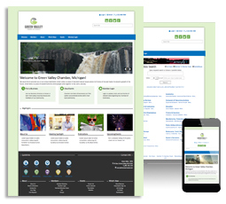
NOVA - New!
- Features an animated image overlay style for content areas
- Hero area can be an image, slider or video
- Offers display of content above the fold
- Sticky Header on scroll and will dynamically resize logo
- Bold headlines for engaging content
- Option for header images on Inside pages
- A modern flare to a traditional layout that engages users and focuses on content
See a live example »
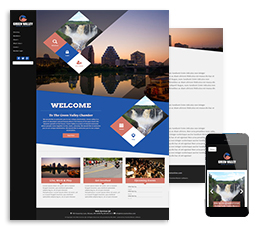
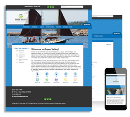
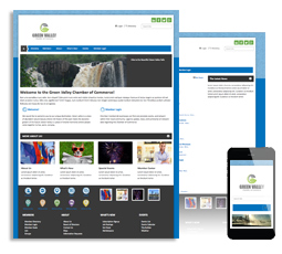
ARGYLE - New!
- Vertical navigation
- Features a trendy geometric design with angled separations
- Engaging animation on home page
- Prominent quick links
- Great option for tall vertical logos
- Includes a parallax background image featured on both home and inside pages
See a live example »
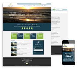
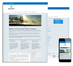
CAPTIVATE - New!
- Rotating slider with image zoom
- Sticky Header on scroll will dynamically resize logo
- Styled slider area with prominent call to action button
- Home page transition and animation effects
- Spotlight call-out area
- CM/MZ widget: new ‘Box’ styling for events, new members, or news releases
See a live example »
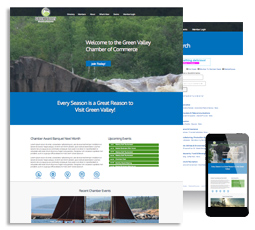
BEARDEN
- Rotating header with sliding action
- Built in ad space
- Module icon links
- Category link area
- Great option for CVBs
See a live example »
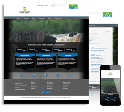
EDEN
- Featured content area with images
- Rotating header
- Custom design feel
- Content block features
- Footer link menu
- Great option for CVBs
See a live example »
ADAMS
- Clean design look
- Full image background option
- Rotating header with text field
- Content block features
- Footer link menu
- Photo gallery
See a live example »
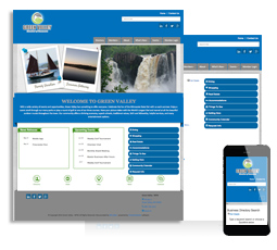
ROCKWELL
- Color theme options
- Rotating header with text field
- Tab box and facebook feed
- Expanding tabs
- Photo gallery
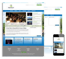
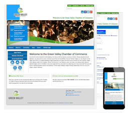
MOSES
- Color theme options
- Rotating header with text field
- Feature content with large images
- Category and directory icons